Pages 1-4: now in glorious monochrome!
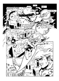
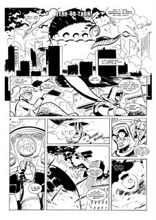
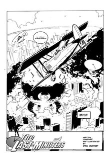
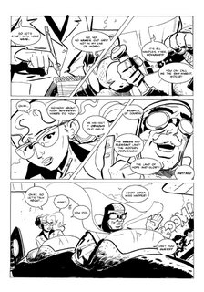
I'm really liking the black and white, so that's where this is going from now on I think. Hope you cats dig it. You'll have seen pages one and three before now, but check out the updated page two (I'm really pleased with it) and the ALL-NEW page four. Woo!
As always, start from the bottom - and click to enlarge!
As always, start from the bottom - and click to enlarge!


7 Comments:
hey man,
I do like the art, but I found page four tricky to follow for some reason though im not versed in graphic novels. Also i'd worry 'bout owen wilson wanting some image rights royalty! :) perhaps a little too blatant? if you want the character to be considered on his own merits rather than people saying "yeah that 'owen wilson' guy" Sorry if I come off too critical, besides you've had enough ego stroking of late :) good stuff though.
Hey man - thanks as always for the excellent comments. I see what you mean about the layout of page four: I think it's pretty clear, but then I *do* read an awful lot of comics. And I can see how there might be a problem here as it doesn't read quite left to right - it's more a forked path down the left and the right. If it's tricky to read, then I might have to pull my experimental side in a little.
And I'm actually really pleased that you think he looks too much like Owen Wilson! I didn't use any photo refs, but I kind of had him in my head as I was drawing Alphaman, and his is definitely the voice I have in mind for the character. This might seem a little gimmicky, but his best friend/Batman-type counterpart has a kind of Ben Stiller thing going on. I figured these two were a nice modern analogue for the Batman/Superman duo, but I dunno - maybe this needs to be more subtle.
Side note: would you have found page four less difficult to follow had it been in colour?
D
Its the flying sequence, i read it before i *should* If the colour almost acted like a gradient running down the page then it may help tie the panel to where it belongs? if you see what i mean?
BTW I have new stuff and WIP stuff on my blog so send me your thoughts, one of them is a new Atlantis pic
Jay, thanks again man. I guess it doesn't really matter if you read the flying stuff first, just as long as you *eventually* read the falling down bit. It can be read in any order really, and should still make sense. I had a look at your sketch blog yesterday and I *love* the LG logo. Really nice. Will comment over there shortly.
Mr Spink - really pleased you're enjoying it. I was actually a little worried there was too much dialogue - glad you think the reverse is true. I'm probably not going to be colouring this, but I think it works okay anyway, no?
Hi, D!
I REALLY prefer the black and white format. It has so much visual impact and strength for me. Page 4 is exciting stuff. I love the Terror-Tron with its gaping mouth - I wasn`t expecting that.
The drawing of the hero`s flight from the police officer to save Alison is spectacular. It`s a brilliant representation of flight - I can almost hear and feel the disturbance in the air as he goes after her.
I think he is such a handsome hero. I do like his long hair and his honed muscular build. As for that glint in his eye in the last frame - is Alison REALLY in safe hands . . . ? Lucky girl! However, enough drooling . . . !
As for the re-worked page 2, I think it is first class. It enhances the close-ups and action, I feel, making the reader feel as if they are actually there.
All I can say is, the black and white makes your drawing really stand out, in my opinion and shows off the finer detail of it to perfection. Roll on the next instalment, Dan! BJ
Thanks BJ! I'm not sure I see what you mean about the mouth - but I really like your thoughts on Alphaman. I was really pleased with that bottom panel of him flying: looks like he's really pouring on the speed. And yeah. I really want him to be a cocky wee bastard, so I'm glad this comes over in the "glint".
Page two was such a hassle to get right. Honestly, the board is *thick* with Tippex. But I'm glad you dig it. After the amount of time I put in on the machine, the plane and the buildings, the bit I was most pleased with was the little helicopters.
Crumbs, I haven't a clue Miss McC! I guess I had kind of mapped it out such that it would be 22 pages (which is about the standard length of an American comic book), but it may go over. Or under. I'm just going to keep going till I reach my cliffhanger, then take a wee break (like two weeks), then come back and pick up part two with a new cover, splash page etc. If I intend to get this published (which I do!), then some editing/rejigging will probably be in order.
I'm really pleased you like it!
Can I get a quick vote on this: do people prefer the colour or the black and white?
Post a Comment
Subscribe to Post Comments [Atom]
<< Home