A**** and The Z**** - page 12
Why the weird post title? Cos I'm changing the name of my comic VERY SOON. Just as soon as I've got a logo and what-have-you sorted out. Keep em peeled guys.
In the meantime, check out page 12. For the art nerds out there, this saw me trying out a few new things: different bristol board (slightly coarser and thinner than the old stuff) pen/brush/ink instead of marker pens and a different font for the lettering. I think it looks a little rough in places but nice.
Criticism appreciated as always - I'm *literally* all ears over here.
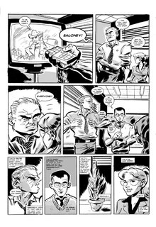

posted by Dan McDaid at
5:23 PM
![]()
![]()

4 Comments:
Hi dude,
This seems much more reined in and 'controlled' both in terms of the art and the story, its a nice contrast to the previous outlandish page. It seems very much like the begining of a new chapter or at least, new parargraph. Needless to say, i like it. I like the very ordered acting and the more structured panels. This works well in the more 'quiet' times. Good work again
This just gets better and better, Dan! The drawing is remarkable and using the pen and ink has given everything even greater definition and clarity. I find the new characters fascinating and I can almost feel the bossman`s breath on me in the close-up in panel three. And the panel with the yucca plant really made me laugh!
This new turn in the storyline is compelling and there is truly great energy revealed in the drawing.
I love it - and can`t wait to see the new name and logo. Good man for not resting on your laurels!
B.J.
I am loving this.
Thanks very much guys. Yeah, I figured a more restrained style would suit the office environment better. Look out for page 13 (woo!!) shortly.
D
Post a Comment
Subscribe to Post Comments [Atom]
<< Home